If you’re reading this, chances are that you are familiar with EPIC EMR, as well my ongoing love/hate thing with EMR’s since I first started writing about them a few years ago.
If you recall, I called most early EMR systems “overpriced, sub-standard, half-baked systems designed by polytech school dropouts”. Ok, so maybe that was a bit harsh.
Epic, is not one of those early systems. Not only is it far better than those early systems, it is now the Jupiter of the EMR universe, far outpacing rivals in terms of adoption. Just because something is popular however, doesn’t meant that it’s good. Pitbull is popular, but all he does is sing words is Spanish and repeat them in English. I mean, am I right? Si, no?
And like Pitbull, Epic EMR has been doing the same thing the same way for too many years. Think about your smartphone or that Tesla in your garage, they get periodically updated; often while you sleep. Epic on the other hand, has been rocking the same look and functionality since about 3 or 4 iphone generations ago. So when my hospital rolled out Epic 2017, after using essentially using the same system for the past 5 years, we were expecting some big changes. Did we get them?
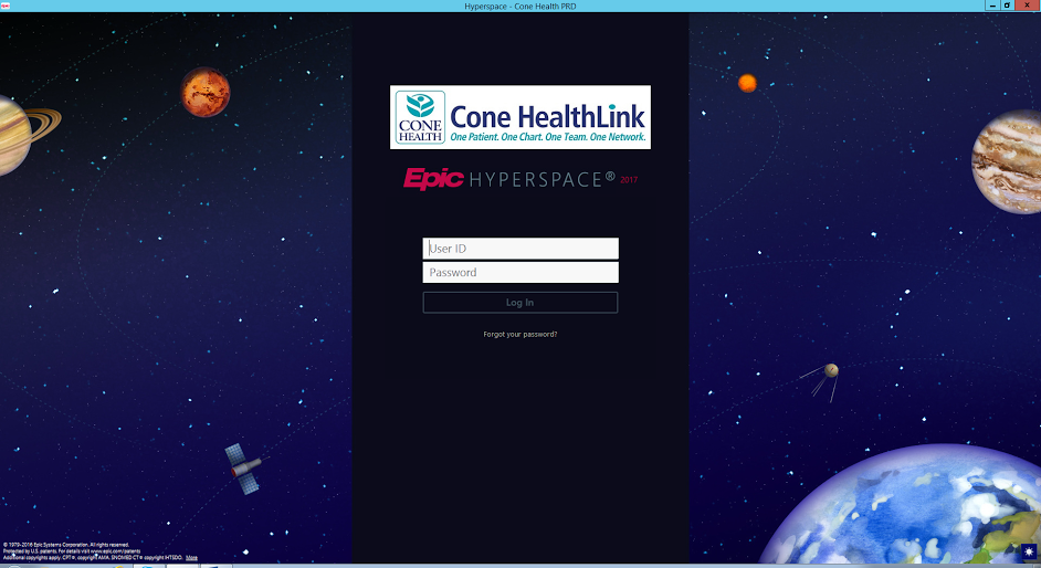
What strikes you right away is the new theme, seen on the sign-in page, and continuing into subsequent screens. The new feel is circa 1960’s space-age, and looks cute compared with the plain old sign on screen. Continue through the sign-on screen, and you find that fonts and colors are slightly different, but overall the change is similar to the effect of changing the theme on your computer or smartphone. EMR deniers will undoubtedly look at this and say “we paid a million bucks for some new fonts?!” Looking at the surface, they might be right. Dive deeper, though, and there are some real changes, but only in one crucial aspect. The bulk of the changes in this 2017 version are in the outpatient screens, which arguably needed the most help.
The inpatient side continues with minimal changes, and I would go so far as to say, if you like your inpatient Epic, you can keep it. In the past, the Epic’s outpatient interface mirrored it’s inpatient one. And that was a problem, because that interface was excessively busy for the inpatient environment, offering too many tabs, menus, doohickeys and thingies, and submenus of those thingies. It’s really hard to make eye contact with a patient after an errant click takes you 3 submenus deep into someone’s religious history when all you really want to know is if they have hypertension. In Epic, 2017, however, the outpatient side finally gets a dedicated pared down screen.
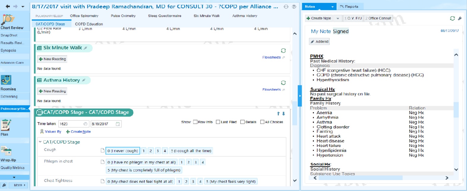
The most obvious change you can see is the switch to Wide View which helps make the screen less busy, placing your note on the right and activies in the middle. The other obvious change is the reduction of menus on the left, to about 10, whereas the inpatient screen has 15, as well as numerous submenus.

However, there is another change which could significantly enhance clinicians’outpatient experience. Since the dawn of the EMR, physicians have had difficulty finishing an entire electronic note in the short time allotted an office visit. Part of the reason for this is that you can’t start a note in Epic EMR until the patient arrives for their visit. Physicians have adapted to this by staying later in the office to finish their notes, or taking their work home with them. Not only can this contribute to burnout, it can lead to incorrect documentation, and excessive cloning of previous notes
Epic now (finally!) allows you to start pre-charting days before the visit without saving your note to the patients medical record. Your pre-charting is saved, but for your eyes only. When the patient arrives your pre-charting will be incorporated into the chart. If the patient no-shows, the system will cause the pre-note to self destruct and then cause an angry looking troll to display on the patient’s phone until they reschedule (though that last part may still be in beta).
These changes significantly improve Epic EMR’s outpatient user experience and puts it nearly on par with some of the better outpatient systems, and possibly my favorite, Allscripts Professional. It certainly is ahead of Cerner’s death-by-checkbox, and of course we will not discuss Greenway here– because of, ya know, “the rumor”**.
Thus we have proof that EMR designers can evolve and transform their systems over time, albeit very slowly. Ball’s in your court, Pitbull!
**The Rumor: It is said that on a cold winter evening in northern Michigan, a physician was charting late into the night in a lonely office cowering at the end of a dead end road. Sitting in a dark room, rimmed only by the light of a lone computer screen, the physician whispered the words “Greenway EMR” 3 times into their Dragon voice recognition software. At once behind them appeared a mid-level HHS administrator, demanding attestation of 10 meaningful use measures. No one has ever heard from that physician again.

