

I’ve never been a gambler, so I don’t really know anything about the game of craps. I just see how it’s portrayed on the big screen–it always seems so fun and dramatic. A guy rolling the dice, surrounded by a group of cheering fans. He says something like “Seven, c’mon seven!” and tosses the dice in the air. For that moment, a drawn out moment, all the faces freeze in gleeful anticipation, watching the dice fly through the air, waiting with hope and anticipation to see where they land. It’s completely left to chance, or maybe luck, or perhaps prayer. For that moment everybody waits, everybody dreams. They live in that moment, waiting to celebrate.
The scene is very much like the one we find ourselves in now. The decision to reopen the economy has been made, the dice have been cast into the air, waiting to land. Already we’re seeing signs that the economy is improving, people are venturing out again for summer getaways. Restaurants and shops are reopening, and there are predictions of improvement in several economic metrics like jobs, and consumer spending. While we have metrics to measure progress on the economy, metrics that measure the concurrent COVID-19 risks are, unfortunately, terrible. In other words, while the potential winnings at the craps table are plain for all to see, the participants in this game are simultaneously blind to the downside risks. Like I said, I’m no gambler, but it would seem to me that a good gambler always knows their risks. Let’s have a look then, at the metrics we’re using to warn us of the risks in the gigantic game of chance.
COVID-19 Testing.
The media has never been very good with numbers, and the statistics heavy reporting during the pandemic has done nothing but reaffirm this. Media outlets continue to highlight “the new cases of coronavirus” without really putting them into the context of the increase in testing. Over this past Memorial Day weekend, media outlets reported that North Carolina experienced a record high number of new cases, with 1107 new cases reported on May 23rd. However they did not report the dramatic jump in testing that had also occurred. Looking at the graph below, you can see that testing has been increasing steadily over the previous weeks. Though if you look closely, you would rightly question my point, because on the day of the record spike, 5/23, there was a relative reduction in testing compared to previous days. This highlights another serious problem with testing, one that CDC director Dr. Robert Redfield recently eluded to when he said “testing sucks, bro”. Ok so he didn’t actually say that. But he did note that there are serious problems with data reporting, he stated that by the time the data reaches the CDC, “regularly the data is delayed and it’s incomplete.“
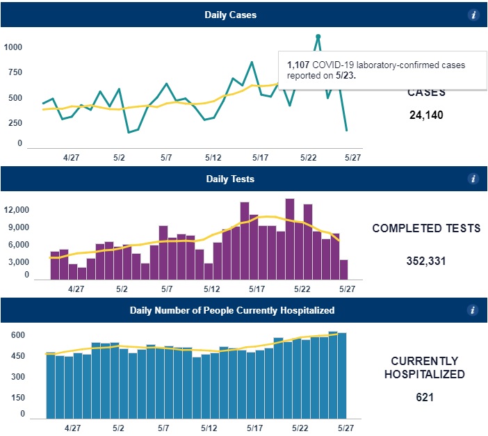
And for that, I hereby nominate him for the award of “Greatest Understatement of the Pandemic by Physician or Scientist”. To put it more simply, test result data is a freaking mess. The data on test results are reported by various different labs, at different times, and in different ways. Some of them might take a week to come back, some might take a few hours. While all labs report all of their positive results, not all labs report negative tests, or report them at the same time. Taking all of this together, if I were to look at that record number of new positive cases on 5/23 could I say with confidence that the data portray an accurate depiction of what was happening on that day? Not at all. The sad thing is that nobody really knows. We’ve taken to using moving averages of data not just because there is day-to-day variability in the data, but because there is a significant variability in the reporting of the data.
Percent positive tests.
The White House guidelines for “Opening Up America Again” called for a 2 week decline in the number of new cases to be achieved before proceeding to a phased reopening. However, it was apparent that as testing volume increased, case numbers would continue to climb. So as an alternative to this they also proposed that a 2 week decline in percent positive COVID-19 tests could also be used as a gating criteria. As with many things in life, this seemed like a good idea at the time, but later had us scratching our heads and wondering what we were thinking. COVID testing initially focused on high risk patients who presented to health care settings. As the pandemic has progressed and testing numbers have increased, we’re now testing more people who are not at the same high-risk profile. We’re performing more surveillance testing at group settings like nursing homes, prisons, and meat processing facilities. We’re screening people before surgeries and outpatient procedures. Screening these lower risk groups has the effect of reducing the percentage of positive tests. This in turn has the effect of making it seem like the prevalence of the disease is decreasing, when it may not be, and very likely going in the opposite direction. Now then, we find ourselves in a rather bizarre situation with two COVID-19 test-based metrics, total positive tests, and percent positive tests. Both of these metrics are telling us two different things yet both are somehow incorrect.
CLI: Syndromic Trending.
Every flu season, people start going to emergency departments and physicians’ offices with flu-like symptoms like fever and cough. Several of these locations are part of a statewide and nationwide network that track the seasonal flu. This system of patient care sites tracking symptoms of flu collectively make up the Influenza Like Illness Network, or ILINet. It’s a great system for tracking flu and gives clinicians a valuable tool as they make preparations for seasonal flu. Sometime in March, someone had the bright idea of using this network to help track COVID-19. It made a lot of sense, after all many of the symptoms were similar, cough and fever, and there was an obvious shortage of testing which perhaps this network could help make up for. At that time, it was the only way for officials to monitor COVID-19 activity. Thus ILINet was rebranded and the COVID-Like Illness Network, CLINet was born.
But there’s a number of reasons why this system, while great for tracking flu, is an imperfect tool for COVID-19 surveillance. First, the system requires that patients present to their doctors offices and ED’s with illness when they are sick. We know that around the country, patients are shunning visits to the health system, my own office visits are down about 50%. Even people with COVID-19 are delaying going to the hospital, and by the time they get there, they tend to be very sick. People are presenting to the hospital often a week or more after their first symptoms. This tells us that there is a considerable time lag between when people are infected and presenting to the ED. By the time CLINet tracks an upward trend, there will already have been a several week backlog of people who have been infected but haven’t yet presented to the healthcare system. In other words, CLI is what we call a lagging indicator, it’s not so much of an early warning indicator as it is an alert that screams “brace for impact!”.
Antibody testing.
Sars CoV2 antibody testing is emerging as an important way to tell if people have been exposed to COVID. It can’t really tell if there’s an uptick in infections, but knowing whether people have been infected is an important part of modeling. Knowing how many people have already been infected reduces the number of susceptible people, and thus the number who could potentially get sick from Covid. The antibody tests have a lot of positive things going for them, they’re relatively quick, painless, point of care, widely available and have fast turnaround times. As such, you’d think that they were the perfect test. Except there’s some issues with them. A positive test certainly could mean that you have had coronavirus, or it may also mean that you haven’t. Or maybe you’ve had another coronavirus that’s cross reacting with the test. With the current test we don’t truly know. But at least if you’ve had a negative test you can be sure that probably maybe have not had it. Or maybe you have. Again, it’s a tough call. For now, it appears that the antibody test will need to wait until the CDC determines that they’re no longer nearly useless.
Hospitalizations
Hospitalizations is probably the only indicator that we have that is not subject to errors from the various sources above. The obvious problem of course is that hospitalizations data is that they are a lagging indicator. If we wait until people start landing in the hospital, it’s probably too late to prevent more people from landing in the hospital. Aside from deaths, it’s the ultimate lagging indicator. Lagging indicators are not useless, they can help tell us when a surge has peaked and provide valuable data for modeling future outbreaks. But they’re not the indicator we need to help us determine when and where the next outbreak will happen and allow us to act in time to stop it.
What are the Metrics we Need?
Tests, tests, and more tests. In order for testing to be a more valuable metric, there needs to be many more of them. Testing sites need to be ubiquitous, and we shouldn’t have to wait 4 days for the results. Currently in the U.S we’re testing about 400,000 people per day, that’s much better than we were a few weeks ago. But several groups who look at the numbers of tests required to safely monitor the public are calling for much higher numbers, and there are a number of estimates that cover a very wide range. On the low end you have a group from Harvard calling for 900k tests per day at a minimum. At the high end there’s another group, also from Harvard, calling for 2 million tests per day to start, ramping up to 5 million tests per day by early June. Harvard apparently has a very large campus and it was too far for the two groups to walk and meet each other.
By increasing the numbers of tests in this way, we could more easily know the true prevalence in any given community, and see when it is increasing. In lieu of widespread COVID patient testing, we could be helped by some other metrics that give us clues about disease activity, and thus help in predicting disease outbreaks before they happen. Testing of wastewater samples, for example can identify the presence of coronavirus in a community even before the first case is identified. Kinsa, a smart thermometer, has shown that it’s aggregated data can predict disease activity 3 weeks in advance. Increased community mobility, as monitored by tech companies like Facebook and Google, can show that a community is at higher risk of a COVID outbreak. In fact IHME is now using mobility data in constructing their models of COVID activity.
Maybe we’ll finally get testing to where it needs to be. Maybe some of these other metrics will help in predicting future outbreaks before it’s too late to stop them. Maybe coming weeks will see more effective treatments for sick people and meaningful progress towards a vaccine. These are the only things that change the trajectory of the dice as they fly through the air. As healthcare workers all we can do is prepare, and wait for the dice to fall where they may.
Deep Ramachandran, M.D. is a Pulmonary, Critical Care, Sleep Medicine physician, founding CHEST Journal Social Media Editor, and co-Chair of ACCP Social Media Work Group. He blogs at Caduceusblog. He is on twitter @Caduceusblogger.